 The source colourization effects The source colourization effects
Logged on 13/02/13 00:26:00
By "source colourization" what I really mean is "spectral corruption".
The six "intrinsic" FITS images we have above contain the true spectral shapes of six 1 Jy point sources. Since our sky model assumed a flat spectrum, these intrinsic spectra should be flat across our band.
The six "apparent" FITS images we generated similarly contain the apparent spectral shapes of the same six sources, and we can see how these have changed in the presence of solely primary beam effects. Get your predictions in now!
If you're so inclined you can open each of the FITS images, not down the brightnesses of each source and break out the graph paper. A slightly easier method is to just write a script. The script I've written to extract and plot the source spectra is attached below, with the blisteringly-imaginatve name 'plot_spectra.py'. Again this script is probably a little rough around the edges (IANA programmer) but it does the job. It's annotated again so please have a look inside.
Basically it uses the Tigger API (I refer you to the Tigger Users' Guide for a full description) to get the positions of the sources in our sky model. It then uses Pyfits and the world coordinate system info from the FITS headers to locate the pixel positions of each source in the map. It extracts the brightness at the relevant position from each of the spectral channels for both the true and apparent case and then plots a per source spectrum using matplotlib which is saved to a file.
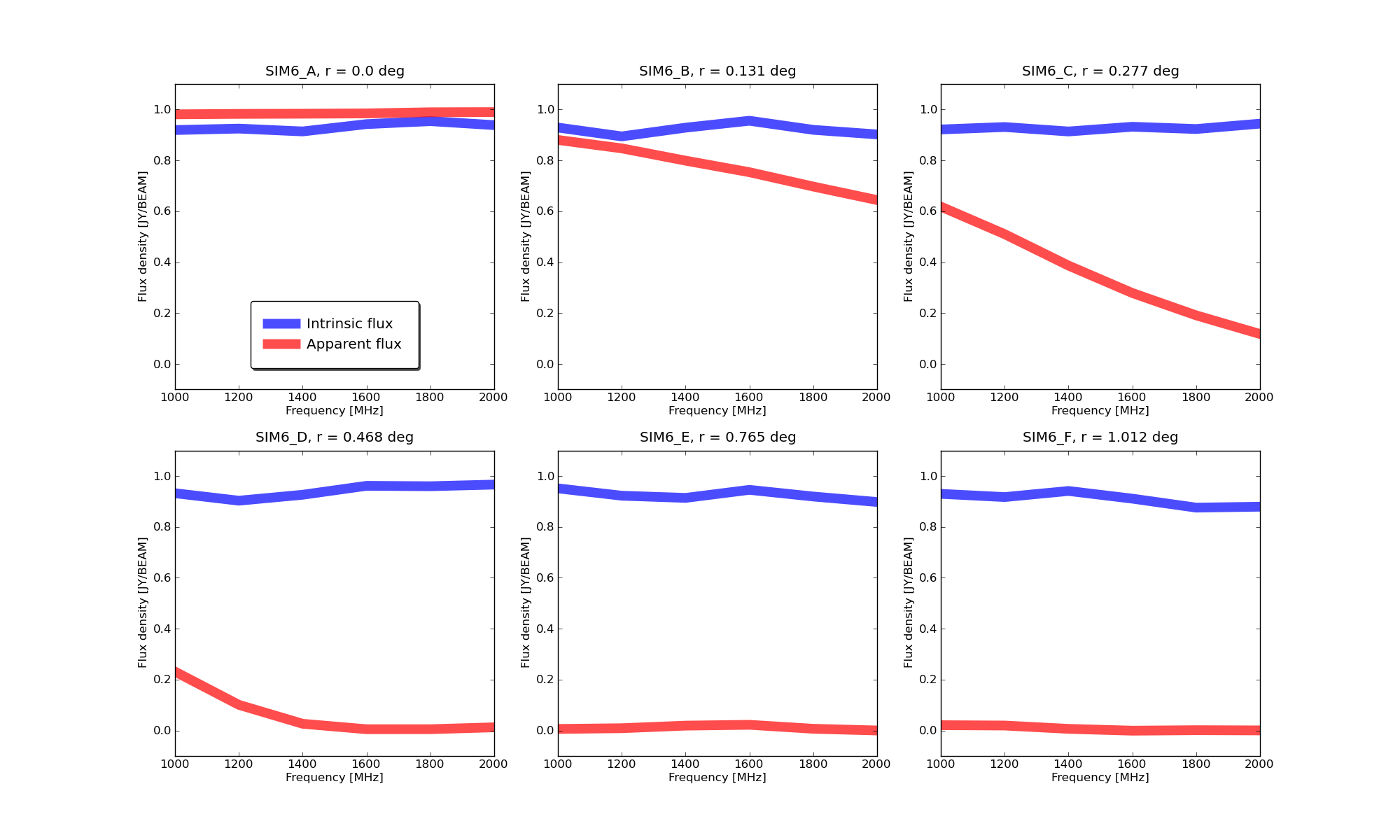
The spectra of each source are plotted and attached below. Each panel represents one source. The blue line shows the measured true source spectrum. This should be a flat line at 1 Jy, as per our sky model. The red lines show the apparent measured spectrum of the source due to the beam effects. As you can see, as well as the beam attenuation, the spectral shapes of the sources can go from flat to convex (SIM6_B) or to concave (SIM6_C, SIM6_D) for sources in the main lobe. The main lobe shrinks with increasing frequency so a source at a fixed distance from the phase centre is observed with reduced sensitivity, causing the attenuation to increase as we move towards the top end of the band.
Sorurce SIM6_E is an interesting case in that it actually rises and then falls as we move up through the band (find and edit the ylim parameter in the plotting script if you want a better look). This is due to a sldelobe washing over it as the observing frequency varies. It also explains why this source was completely attenuated in our first 'by-hand' simulation, as for the 1 GHz observation is was sitting in a primary beam null and was basically invisible to the instrument.
What is causing the ripples in the intrinsic spectra, and why are these sources attenuated? Well, in my opinion this boils down to the PSF and incomplete deconvolution. The PSF is also frequency dependent and sidelobes from one source wash over the other. We weren't particularly careful in our deconvolution so some sidelobes remain, as can be seen in the FITS renders with the compressed pixel scales in the previous Purr entry.
Of course now that you are a batch mode master you can repeat this simulation such that it only simulates and images a sky that only contains each source in turn, to see if you can get the blue lines to match what we know the true sky to be. (Will you need to do deconvolution?)
 |
|